ExtJS Containers and Panels are typically sized by their parent container’s layout. Traveling up the layout chain typically leads to a Viewport, which occupies the available screen space; i.e. (view in Sencha Fiddle):
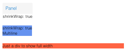
Now what about those times when you want to use these beautiful panels as the actual content, rather than as holders of other content? In other words, how can we make the Panels size based on their content (rather than as dictated by their parent’s layout)? The end result might look something like this:
Read on to find out how its done and what caveats exist…
When you try to use Panels or Containers without having a parent layout dictated (which can by done by either renderTo directly to the body or by being a child of a Container without a layout set), they behave just like you would expect a normal div to behave: the height is sized based on the content and the width is expanded to fill up the available space provided by the parent DOM element. Here’s what a Panel and a Container (with “cornflowerblue” background) would look like (view in Sencha Fiddle):
The setting that will enable us to shrink-wrap the width is called (surprise) shrinkWrap. Do take the time to review its documentation as multiple settings are available (though most of the time you would just set it to “true”): http://docs.sencha.com/extjs/5.0.0/apidocs/#!/api/Ext.Component-cfg-shrinkWrap
Here is an example of using this setting with the Panel and Container shown above (view in Sencha Fiddle):
Note that the “cornflowerblue” Container did not react to the setting like the Panel did. While I consider this a bug, from talking to the framework engineers this is “by design” (with a technical explanation that was beyond me), so I wouldn’t count on it changing anytime soon. The fix is rather straightforward though – just add “display: inline-block” to the style, while still keeping the shrinkWrap true set (view in Sencha Fiddle):
shrinkWrap in ExtJS 4 and 5 Containers,


