A few weeks ago I was at SenchaCon 2015 and majority of the sessions I attended revolved around ExtJS6 and Sencha’s responsive strategy. In summary: an effort has been made to converge ExtJS5 and Sencha Touch 2, but ultimately you will still be building a separate ExtJS and a separate Touch app. You do not end up with truly “one framework”, which is what I hoped for. Read on for details…
Tag: IE
ExtJS 4 and 5 vs. IE 6 thru 11
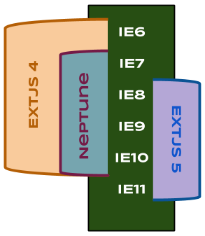
Get a neck stretch and a clear picture of legacy through modern IE support in ExtJS 4 and 5:
Note that the Neptune theme, which shipped in an ExtJS 4 dot release, does not support IE6. It makes use of transparent PNGs, which aren’t supported in IE6.
One of the greatest advantages of the ExtJS framework is how far back it supports IEs. The interesting thing here is the “adaptive markup” that it generates, say for a framed panel with gradient headers:
- Pre-IE9: a “heavy” table frame with every edge and corner having a sliced image of the frame
- IE9 (introduced round corners): still a bit of framing for the header gradient image if used with rounded corners
- IE10 & 11: minimal markup utilizing CSS3 effects
ExtJS4 IE Resize on Zoom
Here’s an easy way to break zoom in and out capability in IE7+ in your ExtJS4 application:
There’s a <meta> tag (the ones that go into <head>) that was recommended to me for the sake of reducing IE testing efforts:
<meta http-equiv="X-UA-Compatible" content="IE=8"/> |
The idea here is it forces many IEs to act all in IE8 mode, so you can basically do quick tests in just IE8 and still get a good test coverage. However, it took me some effort to figure out that this breaks re-sizing capability of a Viewport on zoom in IE.

